 VHS Box Art, Volume 1 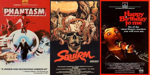 PHANTASM from Embassy Home Entertainment Chris: When I was a child just getting my horror movie "wings" as it were, Phantasm and myself crossed paths. At the time, the two things that popped out at me was the image of Angus Scrimm hunching by a coffin and the odd looking sphere with spikes on the sides. Needless to say, I had to rent it. But why this box art works so well is that it blends in enough nightmarish imagery from the movie for the average video store browser to pay attention. It had enough going on (the aforementioned sphere and hooded druid-like beings up top) to draw your eye and a prominent quote from Michael Welden doesn't hurt either. Josh: This is my favorite style of cover artwork. A collage of images from the movie that intrigues and excites you as you wonder what they mean and how they are going to tie into the movie you are bringing home. This is the type of cover art that lasts rather than the photoshopped stars of the moment that have taken over the home video marketing format. It's all here on this one - hooded creeps, the Tall Man, coffins, and the killer sphere. This image obviously grabbed a lot of horror fans as the film spawned a franchise and is now a genre staple. SQUIRM from Orion Home Video Chris: What's on display here offers a lot more promise of gross-out scenes and scares than the actual movie delivered but this is a classic example of the type of intricate artistry that went into movie posters back then - this isn't something that could be whipped up on Photoshop within half-an-hour. At first glance it seems like a simple composition of a skull surrounded by bulbous worms but looking closer you can see various humans mixed in there and the whole thing has a weird apocalyptic vibe to it. Josh: The more I look at this one, the more likely I feel like I am going to have a nightmare tonight. While the movie is very entertaining, I think the cover is the most horrific part. It is a great image of the skull with all the worms and you know exactly what you are going to get with this flick. The thing that I find so disturbing about it is the people mixed in with the worms and the hand sticking out on the left side. This cover is much more sinister than the movie itself. HAPPY BIRTHDAY TO ME from RCA Columbia Home Video Chris: Quite possibly one of the more famous slasher movie posters out there (which was infuriatingly excised for the movie's DVD release - at least we got an insert) this leapt to the top of many horror fans "must see" list simply by offering us a tease of what the movie might contain. How could you not want to see a movie where someone might possibly be skewered through the movie with a shish kebab? I know I did. And the fact it was all placed on top of a stark black background just made it even more noticeable amongst its peers. Josh: Another classic image of the 80's. The guy getting the shish kebab rammed down his throat was an image that evoked disgust and stuck with teens growing up in that era. As a result, we ended up wanting to see the movie to see if the image was reenacted on the screen. This one still cracks me up whenever I look at it and I wonder why people who make covers these days are so completely devoid of originality. It is so boring looking at row upon row of beautiful people staring back at you. Video stores used to be like art galleries. 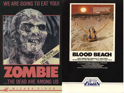 ZOMBIE from Wizard Video Chris: "We Are Going To Eat You!" With a tagline like that and the visage of a maggot-infested zombie staring out at you, how could this not be included on our list? It's the most simple looking box art of the five we've selected but that's what makes it effective. It slaps you in the face with the promise of people being eaten, it shows us who's going to be doing the dining, and it lets our imagination fill in the rest. Josh: This cover is one of the most disturbing covers that I remember from perusing the shelves of the local video store. It was one of those covers that dared you to watch it as you knew it was going to be completely disgusting. I had looked at this box many, many times before finally building up the courage to watch the flick. When I finally did, the movie lived up to its image and the main zombie has become an iconic face for gorehounds the world over. BLOOD BEACH from Media Home Entertainment Chris: Like Zombie, this is another example of "little doing more". A bikini-clad girl is being sucked into the sand during a hot summer day, but by what? And with the box playing off the past success of Jaws by ominously telling us "Just when you thought it was safe to go back in the water... you can't get to it!" they've succeeded in making any genre fan take this home with them for the evening. Josh: Like many horror fans, I love this cover. The picture of a woman being sucked into the sand is original and memorable and still brings a smile to my face today. The clever riff-on-Jaws tagline and the look on the girl's face make this one a keeper. Anyone who sees this cover has to be intrigued as to what happens to the victims. A simple idea yet very effective. |